Written by Rebecca Malcolm
The Guinea Pigs?
Q: What’s the difference between a Speech Pathology student and a guinea pig?
A: Possibly not much!
Late last year, the Speech Pathology student reps were told that Charles Sturt University was changing its learning management system. Speechies would be part of the trial student group.
Honestly, my first thought was: “Why are *we* the guinea pigs?”
The week before
A week before the session started, I logged into the new platform, Brightspace.
I’m not super techy, so I wanted to check it out before uni started. After all, no-one wants to discover they can’t find anything when the first assessment is due in week 2!
I was expecting it might take a while to adjust and it would just be a hassle – because, remember, I’m not that techy.
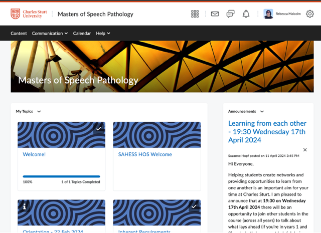
The Brightspace lowdown
Here are some things my fellow Speech-guinea pigs and I have noticed:
- It’s actually pretty user-friendly and easy to adapt to.
- It feels sleeker, neater and more visually appealing than Interact2.
- Each module/unit/section has its own icon.
- I like the layout and organisation. The drop-down menus, clickable icons and pop-out burger menus are easy to navigate.
- Once everyone worked out how to set up the discussion forum (in the communication drop-down menu), it had a more… interactive… feel than Interact2 (sorry… terrible pun). Being able to subscribe to discussion threads again (more easily) is good.
- It sends a message two days before an assignment is due. Are you a perpetual procrastinator who needs reminders? Maybe that’s good. Are you more anxious? You may find yourself stress-yelling at the screen, “You think I don’t know that?!?!”
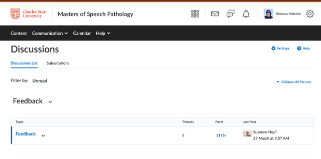
The Brightspace verdict
It’s a different style, so it might take a bit of getting used to, and I’m sure the uni IT gurus are still making tweaks.
But in the end, I’ve found it’s been a pretty smooth transition, and I seem to be able to find things relatively easily.
The Brightspace tips
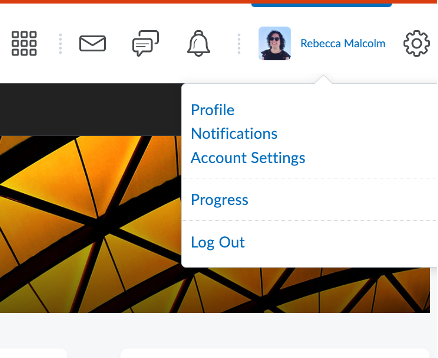
- Deadline notifications: if you’re an anxious stress-yeller, click on your name in the top righthand corner, click “notifications” in the drop-down menu and un-tick whatever your mental health requires you to un-tick.
- If you have accessibility needs: You can modify font sizes and there are voice-access settings too – go to your name > account settings. Accessibility options are there.
- There’s a discussion forum side panel that I missed at first – once you’re in a topic, look for the little grey rectangle on the top left-hand side.
- If you’re stuck: The right-hand side of the drop down menus has a “help” option.
- There’s an app for that! The Brightspace app is available on Google Play and the Apple Store. It’s called “Pulse”. It sounds like a blood-pressure monitoring app, right? It isn’t, I promise!
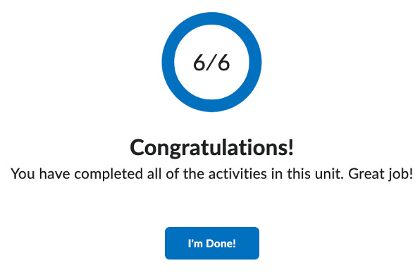
- If you like to peruse material to get an overview first, don’t get trapped by the progress indicators when they say you’re all done if you’re not!
The Brightspace favourite
My favourite part of Brightspace is at the end of each module….
Want to learn more about Brightspace? Click here.


